Self Portrait
Hand drawn animations that represent the state of flux my view of my mind and my body is in, contrasting the rigid unchanging framework of the body I have no choice but to exist in.
Video Sculpture: Week 4
Project 1
Inspiration
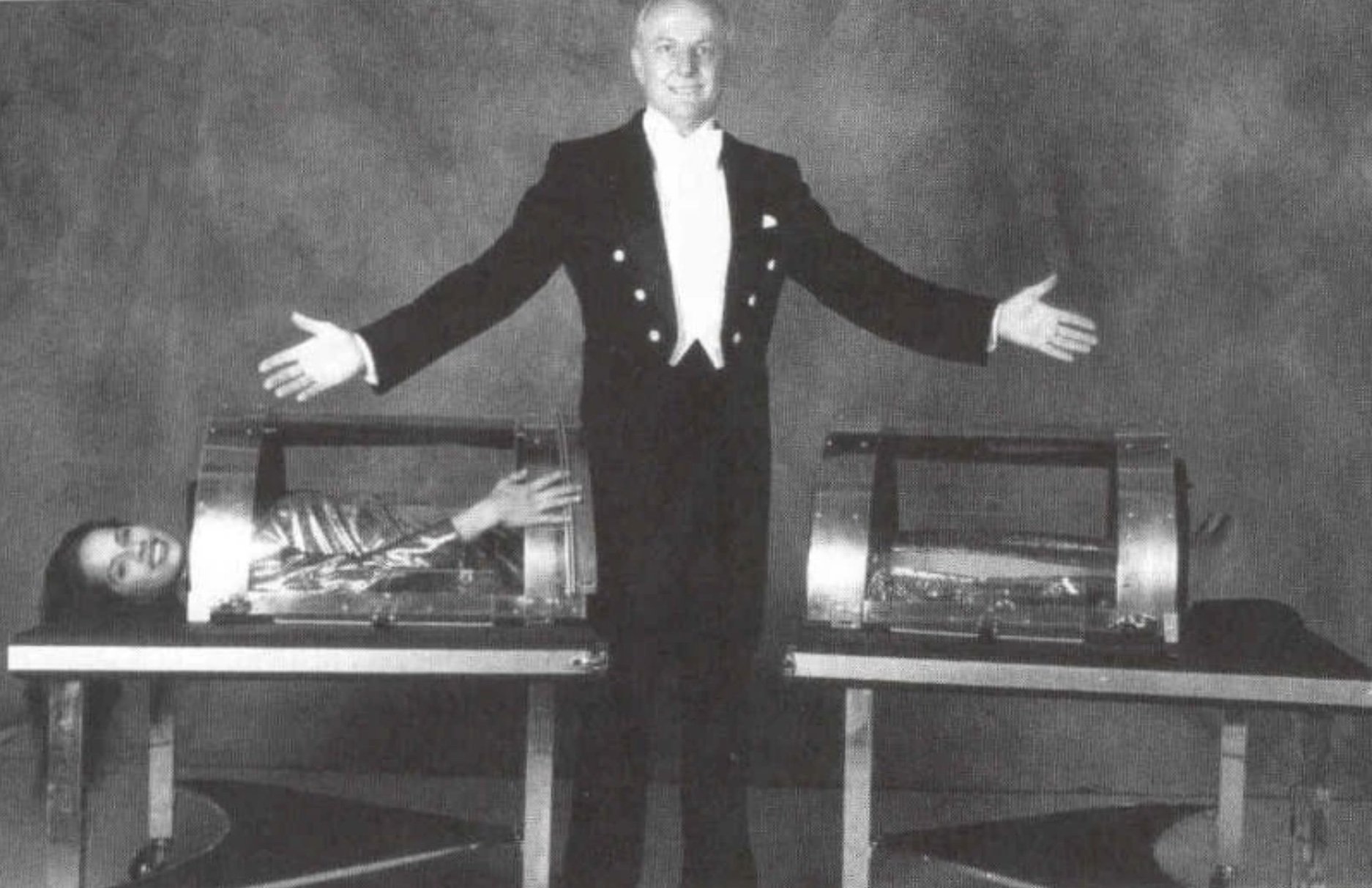
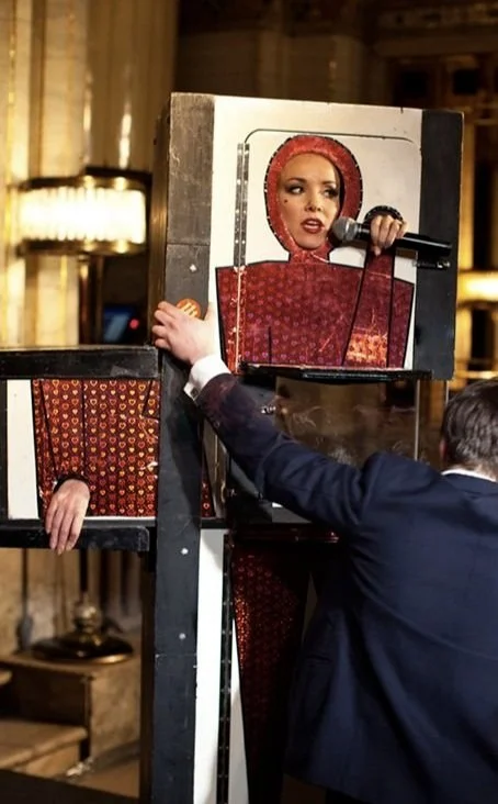
It’s strange how many magic tricks involve smiling women having their body disassembled. It’s like, every magician’s favorite thing to do.
Image Source
Left: NYPL The Magic Show, 1978
Right: Alexis Terry and John van der Put perform The Box at The Criterion
Middle: Crystal Sawing
In the spirit of chopping up women, I made a self portrait of hand-drawn animations breaking myself into metaphoric parts. Below, on the left is my concept sketch and on the right are three of final animations. The shape of the body was traced from the 3D scan of me I used for previous projects.
Using the shape of the body, I hand drew a series of animations that would align with the shape of the body frame.
I have chopped up women’s bodies in my projects before. Paintings of busts without heads or arms, women I’ve sculpted out of bathbombs that melt away when water is dripped on them. In this project I explored the body as modular rather than dissectible.
I mounted a projector to the ceiling using a magic arm and projected the outline of the body onto the table. I put my already created animations on iPads and lined them up so I could adjust the scale of the projection to be perfect. I traced the outline, and cut it out to get an idea of how the screens would sit and the scale. The ultimate project is smaller than life size because of size limitations on the iPad screens. I chose to make the product smaller rather than make the animations more zoomed in because I wanted to have more lines of the body to play with in my animations.
I made small paper prototypes to figure out how to put everything together and not end up throwing any iPads onto the ground. Though I’m sure I could have played it off as part of the experience if it did happen.
Then I placed it over the drawing I made to figure out where the placement of each screen should be in relation to the body. There were a lot of moving parts that had to line up perfectly, digitally and physically. After this I made a cardboard prototype because I was freaked out it wouldn’t align and wanted to confirm in all dimensions that I wasn’t misaligning something.
I created the shape of the mint and pink pieces in Illustrator based on the measurements of the iPad screen. On the left, you’ll see the pieces of the front plate all glued together. This was a delicate operation because laser cutting acrylic melts it, potentially leaving gaps where the pieces won’t fit together right. Because this was the most visible layer, I had to really meticulously glue each piece using acrylic glue (because it chemically melts the acrylic, which forms a better bond for such thin edges and also makes up for the small gaps where the melted edges aren’t exact matches.) There was a lot of ways this could go wrong, but I was able to get a decent finish with the glue.
Acrylic paper peel for your viewing pleasure
And the working first version of the final product as it stands:
You can see the final outcome of this project here


